Content is not king, and what to do about it
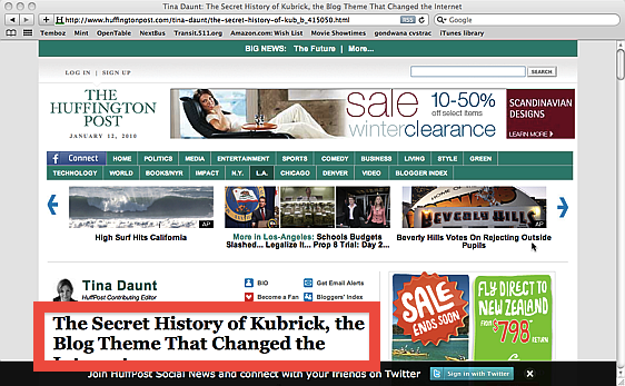
As this screen shot from the Huffington Post demonstrates. On my MacBook Air (1280×800) I can’t even see the complete headline (highlighted in red). On my office PC (1280×1024) I can see the headline and a smidgen of text. All in all, the content occupies barely 5% of the browser window…
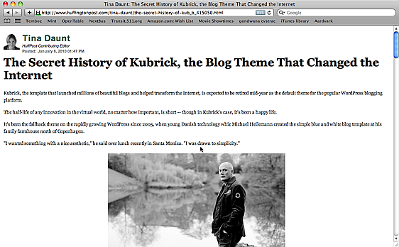
Advertising is not to blame, as it only takes up 12% of the real estate. The rest is hypertrophied navigation, chartjunk, wasted space, blegs and other come-hithers. Horrors like these are what make the Aardvark extension/bookmarklet essential. A few seconds with it yield this much improved result:
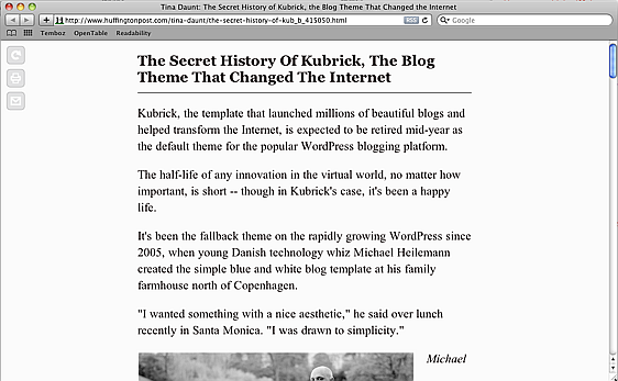
An even better option in this case is the Readability bookmarklet, which requires zero work, but may not work in all cases.
On a completely unrelated note, I highly recommend Andy Odlyzko’s paper (PDF) of the same title.


